About Data Graphs
The graphing function allows you to see how the condition of assets varies over a Section and to compare multiple condition measures.
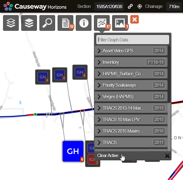
When a Section is selected, the graphing icon becomes available. The number displayed in the Graphing icon indicates the number of data sources that are available for graphing against this Section.
![]()
Under the Graphing drop-down, each survey type and inventory shows as a folder. The Condition Parameters and data items that are collected as part of the survey or inventory are listed under the corresponding folder.
Under the Graphing drop-down, each survey type (e.g. TRACS, TSD, SCRIM) shows as a folder. The Condition Parameters that are collected as part of the survey are listed under the corresponding folder. Historical survey information is included for context. This is organised by calendar year to provide the latest data for that year per Section and XSP.
Projected future condition is also included for context. This is shown in folders starting Det Con for Deteriorated Condition. It is an extrapolation on the latest condition survey data using the deterioration profiles used by Horizons. It gives an indication of the likely rate of deterioration over each Section.
When you select one or more items of graphing data, the graphing panel opens and shows the selected data graphed against the Section’s length. Any data Layer that is also selected is not plotted on the graph.
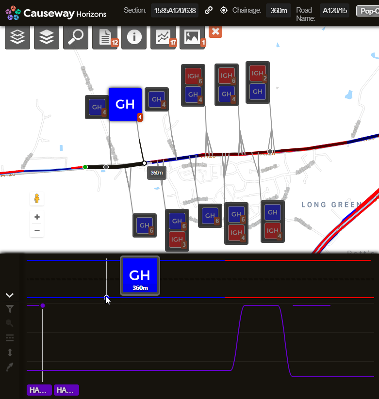
The graphing panel can be switched between Graph mode and Cross-Sectional Position (XSP) mode. The graphing panel defaults to Graph mode. Graph mode shows the view with section chainage in the horizontal axis and item values in the vertical axis. XSP mode shows the data as if looking down on the road from above. So you generally use the Graph mode to look at road condition and XSP mode to look at which lane (or Feature Code) the data was captured for.
A single line is plotted for each Cross-Sectional Position (e.g. lane) of data. Multiple distinct parameters, from the same or different surveys, can be viewed in the graphing panel simultaneously. Selected Condition Parameters can relate to distinct properties, each with different units, scale and resolution. The graphing module displays data by scaling the Condition Parameter values to maximise the visible range on the graph. As a result, by default, the values presented in the graph are not to scale. To compare condition values with the same units of measure on the same scale, you can click the Scale to Fit button.
To increase the availability of data across the Network, data loaded in Horizons is processed using a gap filling strategy . Where a gap is encountered for any one subsection length, it is interpolated using the average of its neighbouring subsections.