Show the Graph
Display graphing data for a Section
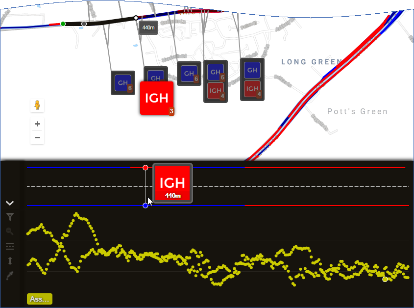
When a Section is selected, you can see a detailed visualisation of its condition in the Graphing panel.
The values of your chosen parameters are displayed as colour-coded points/lines along a horizontal graph that represents the active Section. For more granularity, you can switch to XSP View, which separates the data values into the Cross-Sectional Positions they were measured on, e.g Left Lane 1, Right Footway.
This provides a stylised depiction of the Section that's abstract but accurate! Use it to identify problematic areas that require attention, compare multiple parameters alongside each other, and get a good picture of the Section's overall condition.
Data from active Layers is only shown on the map, not in the Graphing panel.
Select the parameters
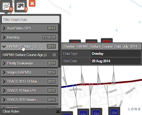
To view graphing data for a Section:
-
Select the Section you want to examine.
-
Select the top Graphing icon. In the dropdown, each folder represents an available data source (see Data Import). Select one or more Condition Parameters across multiple folders - you can mix and match!
-
The Graphing panel will appear at the bottom of the map. By default, data values from separate XSPs are shown alongside each other. Use the icons on the left to configure how the data is displayed.
To learn more, see Understanding Graphs.