Define a Deterioration Curve
Customise how future condition is predicted
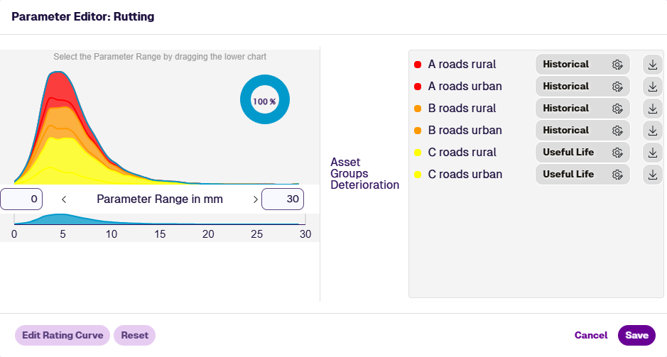
When editing a Condition Parameter, all applicable Asset Groups are listed. Each one has its own deterioration curve, which determines how future parameter values are calculated for those assets.
By default, Historical deterioration curves are calculated from past survey data for that parameter on that Asset Group. Other methods provide different future projections, including Linear, Quadratic and Useful Life.
To edit the deterioration curve of an Asset Group, select its Edit button. If the button isn't visible, the Parameter Range is currently modified. Select Save to confirm the changes, or Reset to revert them, and the button will appear.
These are informed estimates based on past trends. The more survey data available, the more accurate they can be. However, unforeseen events can still influence future deterioration, e.g. adverse weather, increased traffic flow.
The Deterioration Editor
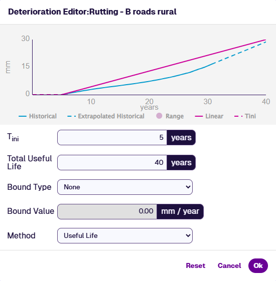
Graph
The Deterioration Editor displays a line graph of actual and extrapolated parameter values over the total useful life of the Asset Group, in years.
The blue line is the historical deterioration curve, computed statistically from all data in your company project for the selected Asset Group. If you use another method to define your own deterioration curve, the historical curve remains visible as a reference to compare against.
Solid line sections represent actual parameter values. Dotted line sections indicate extrapolated values, which can extend backwards behind a solid line as well as forwards.
In the example below, the earliest survey data was collected 10 years after the earliest asset installation date. The first dotted line therefore indicates how the intermediate years were calculated (assuming the Condition Parameter was 0 mm at installation).
To focus on a particular line, hover over the corresponding legend beneath the graph. To zoom into a section of the graph, drag a selection box along it. Select Reset zoom to zoom out again.
Settings
The Deterioration Editor displays the following settings:
-
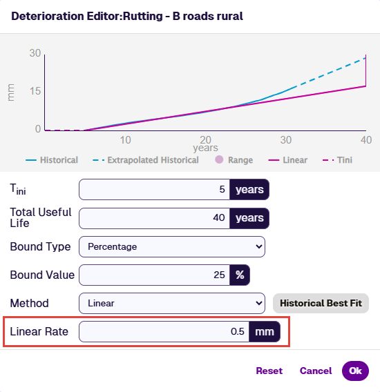
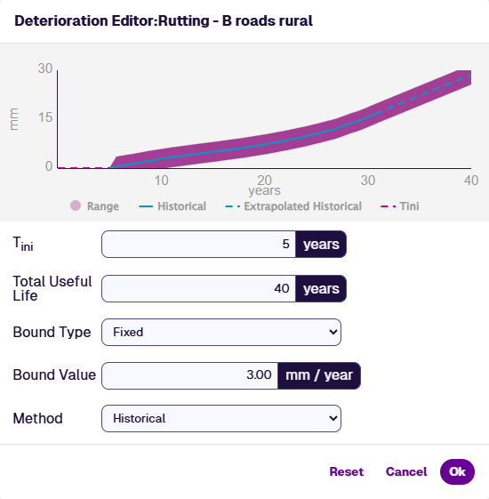
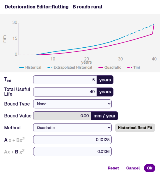
Tini - the number of years before any deterioration begins.
-
Total Useful Life - the number of years that assets are expected to be in service before decommission.
-
Bound Type - you can generate a Deterioration Bounds Layer to visualise which subsections are deteriorating as expected, faster than expected, or slower than expected for this parameter on this Asset Group. To define the "within bounds" range of expected values for any age, choose one of the following:
-
None - don't define bounds for this parameter. A Deterioration Bounds Layer won't be generated for this parameter and Asset Group.
-
Fixed - define a fixed range for the deterioration bounds. The upper and lower limits are a fixed amount above and below the line, creating a consistent margin for expected condition values.
-
Percentage - define a varying range. The upper and lower limits are a percentage above and below the line, creating a proportional margin for expected condition values.
-
-
Bound Value - the Fixed or Percentage value of the chosen Bound Type.
-
Method - the method used to calculate the curve. Extra settings may appear depending on the chosen method (see below).
Choose the desired Method and edit the settings accordingly. The graph above automatically updates to reflect your settings. Select Save to confirm your changes or Reset to revert them.
Methods
Linear
Define an annual rate of change that is the same each year. This produces a linear curve with a constant fixed gradient. Use the Historical Best Fit button to automatically populate the Linear Rate field with a value that best aligns with the historical survey data.
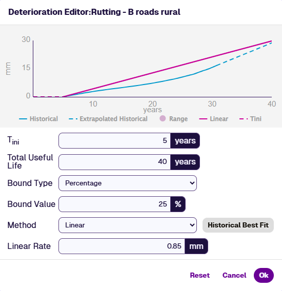
Example of Linear Rate being too low
If the defined deterioration curve does not reach the maximum Parameter Range value by the end of Total Useful Life, it is forced to do so. This can produce an unusual step at the end of the graph, as illustrated below.
In this example, the Linear Rate for rutting is set to 0.5 mm per year and the Total Useful Life is 30 years. The maximum Parameter Range for rutting is 30 mm.
The final calculated deterioration value is 15 mm in Year 30. The curve then jumps to 30 mm, as it must reach the end of the Parameter Range by the end of its total useful life.
Therefore, if you set a very low rate of deterioration, be aware that this can cause an unexpected jump to maximum deterioration at the end of the curve.
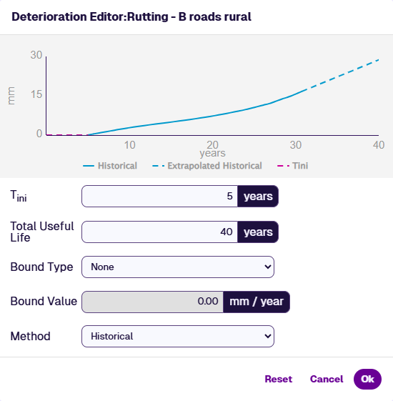
Historical
This method uses past survey data to estimate the deterioration curve for the Condition Parameter, following the onset of deterioration (Tini). This predictive model is deterministic and can be calculated from a minimum of 2 years' worth of data. More historical data increases the model's accuracy.
A historical deterioration curve is calculated by first dividing the Parameter Range of allowed values into bins, where each bin represents a smaller range. The mean rate of deterioration is calculated for each bin over all subsection lengths within the Asset Group. For each subsection length, the year-on-year condition change is used to calculate a deterioration rate for a range of deterioration values.
Example
For example, let condition x represent rutting on a single subsection that deteriorates from 2.3 mm at time tN to 3.0 mm at time tN+1 the following year. The rate of deterioration during that period can be calculated as:
(δx/δt) = (xN+1 - xN) / (tN+1 - tN)
(δx/δt) = (3.0 - 2.3) / 1
(δx/δt) = 0.7 mm per year
This deterioration model is then used to update the mean values for bins within the range of 2.3 mm to 3.0 mm of rutting as shown in A below.
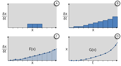
By repeating this process and taking the statistical mean for all subsection lengths, we construct a histogram that describes the mean rate of deterioration for each bin value (see B above). This produces the curve shown in D.
Quadratic
Define the curve according to a quadratic equation. Enter the A and B values for the calculation. Alternatively, use the Historical Best Fit button to automatically populate the fields with values that best align with the historical survey data.
Total Useful Life
Define the curve according to how many years it will take for assets to reach an end-of-life state. This is similar to the Linear method.
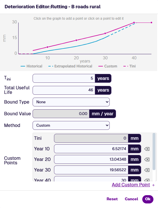
Custom
Plot a fully custom curve, year by year. Select a year on the graph, or use the Add Custom Point button to choose it from the list. For each year, enter a predicted value for the parameter. To remove a year, select its Delete button.
The first and last points can't be edited or deleted. Tini matches the first field and the final year is always the maximum value of the Parameter Range.